Thursday, May 25, 2023

Midpoint of M.F.A. program

Friday, May 19, 2023


Earlier this week, I took 25 art pieces to the Art Center of Citrus County and hung them in order to make a video for my 45 hour review for the MFA program I'm in. (Savannah College of Art and Design.) It was challenging to hang the work, hold the phone, read the script, and not get too emotional when showing my gun violence and Ukraine work.
 

Then my daughter and I spent several hours editing the six short videos into one long one for my presentation before the panel which happens this morning. I feel like I'll be defending a dissertation, and will be glad when it is behind me! 
 
UPDATE:  I PASSED THE REVIEW!!!   Hooray!  Now I can breathe again. It was an excellent opportunity to receive feedback on my work from three brilliant professors.  I took three pages of notes!! 


Thursday, February 10, 2022

What's it Like to be in College Again

Honestly, I don't have time to write this blog, but most of the work is already done, so here goes:

I absolutely love the experience, but school is beating me up.  I turned 67 on Christmas Eve, and I don't have the energy I used to have.  I am getting straight A's so far, and loving a lot of the work, but it has overtaken my life.  (Sorry, Jim) 

We are at midterm and last week was a killer, as so many projects were due.  I'll share one that received  quite a lot of discussion in class last evening.  I would LOVE to hear your response once you read about the process of the work.  The assignment was to create a work that fits into the Late modernist era of Art history. 

Here is my original proposal, followed by a final self critique  

                                                           HOODS 

I debated long and hard before coming up with this idea. I thought about the action painters, the color field artists, the Abstract Expressionists. I was ready to create a portrait in abstract expressionist style (which I’ve done before), when we took a trip to Atlanta to visit our son. Part of the visit included a ride on the Marta trains to go to a basketball game – the Miami Heat vs. the Atlanta Hawks. The first step onto the train was a memorable experience. A strong smell of urine from an older black gentleman who mumbled to himself as he rode along, taking off his shirt and changing into a hoodie, talking the entire time. He shoved his shirt into a Publix bag and hid his face in the hood of his jacket. At the next stop, he gathered his bags, and got up to disembark. He limped bowlegged and with difficulty to the exit door, still muttering to himself. I wanted to cry for him. He was not well. It was COLD in Atlanta while we were there – below freezing – and we saw many tents under bridges throughout the city, where homeless people spent the night. 

We stood and shivered for 25 minutes as we waited for the arena doors to open. Once inside, we saw the teams warming up, and got a look at the fans from both sides. I was tickled to see some of the young black men who were dressed up in crazy colored and patterned shoes (including some of the players!) and I saw some jackets and pants which were works of art. A few had torn and patched and painted designs, including checkered patchwork! Again, memorable. There were lots of interesting hairstyles as well, dreadlocks galore, and others. The next morning at our hotel breakfast, four young men came in from the street and sat down in the lobby. Though we were staying in a nice part of town, and they were not threatening, I felt uncomfortable. They all wore hoodies, one had his skinny jeans well below his rear, and one wore a ski mask. My imagination, fueled by too many news reports, had me hustling back up to the room. 

On the way home, I saw more tents and graffiti, and I thought about the situations of some of the people we had come across. Some are obviously well off and some absolutely not. Some safe, warm and loved and some not. I came across the work of Jacob Lawrence, who did work about social injustice. I thought about the abstract expressionists who looked within themselves for themes that resonate with everyone. I kept the brightly colored Marta ticket, a receipt for dinner, and an artistic coaster from the bar – and I thought about Rauschenberg and collage artists. I read about Carl Jung and his theory of collective unconscious – “. . .beneath one’s private memories is a storehouse of feelings and symbolic associations common to all humans.” p.1112, Art History, Marilyn Stokstad And finally, I remembered the work of Stuart Davis, who made collage like paintings with bright colors and letters and numbers and flat solid shapes, and I finally knew what I would make for this assignment. 

                                        Quilted and lightly gessoed fabric panel 


***** note: Before I came to the Stuart Davis part, I had already started the work and gotten this far. I planned to add graffiti to the bridge, but I wanted it to be bigger and more prominent, and not so representational. Now that I have a better idea about the finished piece, I’ve chosen several bright solid colors and will add modified figures, graffiti letters and numbers, and more shapes to tell the stories. These shapes will be placed collage like all over the format, some sideways or diagonal. I plan to make the figures kind of Gumby like so they will look more irregular and less realistic. My process is to glue the fabric pieces, using matte medium, onto part of an old quilt that I originally handquilted 25 years ago. I’m excited to continue working on this project while the trip is still fresh in my mind. I think it will fit well into this era of art movements. I’ve decided to call it HOODS, which will be one of the graffiti words. Hoodies have a strong symbolic connotation in our current time, and I remember way back when I was in high school (1969 to 1972) when ‘hoods’ was the term for gang member, bad boy types.


And now, for the SURPRISE ENDING!!  Keep reading, please.


We All Need Bread

Last Work of Modernist Art              Karol Kusmaul

Feb. 8, 2022


 To respond to the challenge to create a ‘last work’ of Modernist art, I began looking at work by late Modernist artists. While considering the possibilities, my husband and I got to spend some time in Atlanta, visiting our son, and the experiences there inspired me to tell a visual story. My main impression of the trip was the vast space between those whose basic needs are not met and the ridiculous amount of money that results in enormous skyscrapers and sports arenas.  This thought aligns with the distance between ‘high’ art versus art for everyone. 

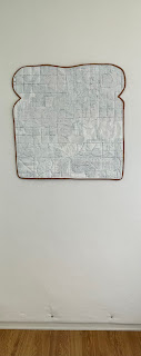
 I began by cutting some fabric shapes and adhering them to a quilted fabric panel,  27” square.

 I still wasn’t sure what style of art I would follow, but I felt the story needed to be expressed. The first shapes were of a bridge, some skyscrapers beyond, and some tents for homeless people below.    

A picture containing chart

Description automatically generated

I probably could have stopped there, and had a Minimalist collage, but I had much more to say.  At this point, I came across the work of Stuart Davis, whose paintings resembled collages, and contained letters and numbers and images related to technology, tall buildings and bright colors, and I decided this was the direction I would take. 

A picture containing text, toy

Description automatically generated


                           Stuart Davis, New York Mural, 1932, Oil on Canvas, 84 x 48”

Living in rural Florida for more than 40 years now, a trip to the big city is a visual treat and an eye opener.  We have no buildings over three stories in my town, and our Main Street is four lanes at most.  While in Atlanta we were able to attend a fantastic basketball game between our Miami Heat and the Atlanta Hawks. Riding on the MARTA rapid transit trains provided an opportunity to see both the poorest and some clearly wealthy people.  I was tickled to see some of the best dressed young black men wearing jeans and jackets with painted and patchwork details.  I saved my train ticket, along with a receipt and bar coaster from dinner out, and was able to include them in my work, al la Rauschenberg. 

A picture containing text, graffiti, several

Description automatically generated


Adding symbols of people and experiences during our visit, the collage soon became quite full. I played music similar to what we heard during the ballgame as I collaged the elements.  It began to resemble more and more a Stuart Davis painting.  It was intense and had strong contrasts.  And then, suggestions from peers and Professor had me considering painting over the piece with watered down gesso, a la Malevich. (Wait, what?!!?) The suggestion of making it shaped like a sandwich seemed far-fetched, until I related the word ‘bread’ to money, and thought about the bread that my husband picks up weekly from the store to take to our churches food pantry for the poor. The new title has become We All Need Bread.

Reading further about the transition from modernism to post modernism, and how it paralleled America’s uncertainty related to Civil Rights and environmental issues, as well as political protests, my plan changes made total sense.  From Stokstad’s Art History text, “Conceptual art of the 1960’s . . . aimed for a simplicity and clarity similar to that found in the works of Stella and Judd.” and, “In retrospect, the Minimalist emphasis on reducing art to its essence should perhaps be seen as an admission of a diminished notion of its power.” Responding to Jasper Johns’ White Flag painting in 1955 further justified me whitewashing the work I had done.  After all, slavery was abolished in 1865, the Civil Rights movement was launched in the 1940’s, and still today black Americans are begging for fair treatment.  

 I sponged gesso over the surface of the collage.

Goodbye, Stuart Davis, goodbye George Segal Subway, goodbye Jacob Lawrence and Romare Bearden.  Hello again Kazimir Malevich, hello Agnes Martin, hello Jasper Johns.  

After two layers of sponged gesso, the work was shaped into bread with a crust of brown binding.  My story is hidden in the sandwich, but it is still there.  We All Need Bread  


                                                              Scale image

https://whitneymuseum.tumblr.com/post/149111301085/stuart-davis-created-new-york-mural-in-response-to

https://www.metmuseum.org/art/collection/search/487065

https://www.history.com/topics/civil-rights-movement/civil-rights-movement-timeline

Marilyn Stokstad, Art History, Harry N Abrams 1995, p1134,1135 


If you made it this far, I would love your feedback about this work, or the story that inspired it. THANKS SO MUCH!

Tuesday, November 23, 2021

 PORTRAIT FUN

I was invited to spend a day with the Tampa Bay Surface Design Guild last Sunday.  They meet at the Art Center on Indian Rocks Beach once a month.  It was a challenge to teach them anything about fiber art that they didn't already know, but we had a great time together constructing portraits.  Each of us brought three pieces (or more) of thrift store clothing - one light, one dark and one medium print.  We put them all together on a table to share. 


This photo was taken later in the day - there was much more than this when we started.  The space was filled with art and was well lit and roomy. 


We worked hard from 9am to 5pm and accomplished a lot in that time.  These ladies are serious about their work but fun loving artists!


Near the end of the day, each artist took the time to evaluate and critique a portrait made by a classmate. 


We then shared our observations and made suggestions and gave compliments about each portrait.  


I was so impressed with the work ethic and creativity of these artists.  It was my pleasure to work with them and I hope to visit again sometime.  Special thanks to Angie, who hosted me the night before.  It was a treat to get to see Angie's studio and meet her husband and her sweet pup.


Saturday, September 11, 2021

Back to SCHOOL


I've decided to use this neglected blog space to journal my new adventure working toward a Master of Fine Arts degree in Painting.  Classes start on Monday, Sept. 13, 2021.  The program I'm in is through Savannah College of Art and Design, and is completely online. 

So far, I have already purchased paints and supplies, practiced, submitted a portfolio of twenty paintings and a statement of purpose, been accepted, been awarded two scholarships, met with one of my three counselors, dropped a painting class to take a graduate drawing course instead, been on a waitlist for the Art History class I wanted, gotten a seat in that class, purchased 6 textbooks, reviewed two syllabi, paid my tuition, and attended about six different orientation sessions.  I visited the library virtually. I've completed two prequarter assignments and emailed a few classmates. I bought a school Tshirt.  I have notebooks and file folders and two calendars. I have a quiet place to work, and a great studio space.

The Professors at SCAD are not playing.  The coursework is rigorous, both in quantity and quality.  I am intimidated, but also completely excited about what I'll be learning.  There will be a ton of reading and writing, and critique.  There will be a lot of vocabulary I'm not familiar with.  Even the studio courses require much high level reading and writing.  This will be my new full time job.  

I've been retired for 11 years now, and I'm ready to go back.  I will need any prayers you can spare. 

Here is something I found that I will try to keep in mind:

Inuit song:

"I think over again my small adventures, my fears, these small ones that seemed so big.  For all the things I had to get and to reach.  And yet there is only one great thing.  The only thing.  To live to see the great day that dawns. and the light that fills the world."

Tuesday, January 19, 2021

From Rejection to Acceptance


 In 2016 I made an art quilt out of leather.  I made it for an exhibit called HerStory, about American women who have made groundbreaking achievements.  The first woman I thought of was Dr. Temple Grandin.  My brother in law was in agriculture and had worked with her years ago.  My sister shared with me a book about Dr. Grandin, which informed me of her childhood and struggles with autism.  She currently is a professor of Animal Sciences at Colorado State University.  There is a wonderful movie about her, called Temple Grandin - you should see it if you have not done so.  

While I was thinking about making her portrait, a friend gave me some large pieces of pumpkin colored leather he had found at a garage sale.  Since Temple worked with cattle and horses, I decided I would try and do the portrait on leather!  I purchased special needles and learned that stitching on leather is not much different than on fabric.  I chose to use the inside of the leather pieces, as they were wonderfully soft like suede. 

I painted the details and shading with oil paint, and added drawings of some cattle pens and chutes in the background.  On the back of the quilt is a blue sky and white cloud fabric, which is reminiscent of a scene in the movie where Temple is seeing images in the clouds. 


The quilt was submitted for jurying, along with another one that I made to honor Susan Shie, an artist who has overcome a vision disability to become a rockstar art quilter.  In January of 2017, I received from the jurors a happy email about Susan's quilt, and a 'We're sorry' email about Temple's. Susan's quilt is still traveling the world with the HerStory exhibit, and Temple's went into a pile under the bed in my guest room.  

In September of 2017, I wrote an email to someone at Colorado State University, where Dr. Grandin is a professor.  I asked if they would consider purchasing the quilt and placing it somewhere in the university to honor her.  Apparently they were not interested in this idea, as I never heard back from them.  Then on November 1st, my dad passed away, and I had other concerns than to follow up on the quilt purchase.  

Fast forward to January of 2021.  I pulled the quilts from under the bed to say hello and to restack them.  I set Temple aside, deciding to finally follow up .  In doing some further research online, I discovered that she had earned her doctorate at the University of Illinois.  I was born in Illinois and decided I would offer the quilt to them.  This time, I offered it, not for sale, but as a donation.  I found the gentleman in charge of Animal Sciences on the U of I website, and sent him the story of this quilt.  Within an hour, I received an enthusiastic, affirmative response from Dr. Rodney Johnson.  He had worked with Dr. Grandin and shared an office with her, so he was as excited about honoring her as I am.  He tells me that the quilt will be displayed in a glass case in the Animal Sciences Laboratory at the university in Champaign Urbana.  I'm delighted that Temple's quilt will get to come out from under the bed and be seen and appreciated by people there at U of I.  

Don't you just LOVE a happy ending? 

Tuesday, May 19, 2020

Pipes

Among the effects of the Corona virus was the cancellation of a week long class I had planned to take with Jill Kertulla.  Jill makes fiber art beginning with photos on fabric, and then she manipulates them in many ways to create her own fabulous vision.

I was SO looking forward to the class, and SO disappointed.  I don't take disappointment well, so here's how I handled the situation:

1. I had already ordered and received my images on fabric, and gathered all the supplies for the class.
2. Jill had written an article about some of her methods, which was published in Quilting Arts magazine
3. I decided that I would fearlessly proceed on my own, using what I had already gathered and Jill's advice from the article.

One of the images I had printed was of some water pipes.  My daughter is involved in the technology aspect of water movement, and so I had taken several photos of pipes, wheels, and chains.  They are interesting sculptural forms, and I planned to do some fabric collage studies of them.


Here is the image I started with:


This is what I had printed onto fabric:


Not knowing what I was doing, I began painting the blue pipes with transparent fabric paint:


Here is how it looked when the pipes were all painted:


Then, I auditioned fabrics for the sidewalk and grass areas.  Some would add color, some were sheer and would add texture or pattern.


One of the techniques Jill recommended was trapunto, or adding an extra layer of batting to certain areas that you want to look raised.  I stitched around the wheel to make it puffier.  Here is how it looked on the back after trimming away the extra batting:


Next, I made a paper pattern for the grassy area.


I wanted to try Jill's method of weaving strips of fabric, so I cut some slits into this piece:


Because the woven areas were flimsy and floppy, I secured them on the back with some iron on stabilizer.  (Learning as I go!)  The yellow flowers are part of my ironing board cover.


If you look closely, you can see what I've added to the sidewalk areas.  Cheesecloth, patterned tulle, printed fabrics, machine and hand stitching.


More hand and machine stitching to flatten the background areas, and to add textural interest:


Here, I've added some dyed string to the lower sidewalk area.  I knew I would find a use for that string I saved from a shibori process!!  I've also added some embroidered and appliqued details.


Here is the piece with the facing added and waiting to be hand stitched on the back.

I plan to give this to my daughter to hang in her office.  I'm glad I tackled this project!  I look forward to trying another image using these techniques.  On this first one, I didn't stray far from the original photograph.  Now I have more courage and will try making some more artistic changes to the next image.

Thank you Jill, for attempting to teach our group, and for your guidance and inspiration!!


Monday, January 20, 2020

Miss Peach

I think we had a hamster named Miss Peach once.  Anyway, it seemed a good name for the portrait I recently made on my longarm quilting machine.  Peach was not made in my normal slow way of designing.  Usually, I work on my vertical design wall and spend many days cutting, pinning, standing back to look, adjusting, studying, trimming, patching, changing my mind, and then finally, over several days, handstitching each piece onto the background, then quilting the three layers together. 
With the new method, I can bypass some of the steps, and get a quilt designed, and quilted in one day. I began with a backing fabric, batting, and part of a beautiful hand-dyed damask tablecloth - all pinned to my longarm frame.  I then chose some fabric prints that I thought 'went with' the background. 


I made an effort to limit the colors to only a few, and I included various size motifs.  I used one fabric for a contrasting background shape at the top.
I then began cutting shapes for the shoulders, neck and head, and then moved on to the features.  Instead of pinning, I just placed the shapes onto the background, and tried not to sneeze.
Here is Peach before she got hair.

 
With this method, I am designing horizontally, at about chest level.  This makes it impossible to stand back and squint at the composition, as I am used to doing.  To get a good look at what is happening, I have to climb up on a ladder and take a photo.
Peach looked a bit better with her hair added.


The next step is to carefully cover the entire design with tulle, and then quilt heavily over all in order to hold all the loose pieces in place.  I had a gauzy fabric from a dress, which I wanted to audition.


Nope. Too foggy!  So I went with a peach colored tulle, which is nearly transparent.  I pinned the tulle along the edges, and quilted all over.  Here she is after the quilting.


I took her off the machine, added a facing, and took a good look.  Oh, dear, she has a beard.  Normally, it wouldn't bother me to have flowers or polkadots or birds or any motif on the face, but this time, the random placement looked like either a beard or some bad scrapes on her chin.  Not despairing, I got out some paint and stamps, and set out to obscure the dark flowers. 
Here is the final version.


I may have gotten carried away with the stamping.
So, I think I will try this method again.  It is a huge timesaver.  When I do, I will take more time to study the composition before beginning the quilting. 
I'm still much more comfortable with my slow process, but sometimes, it's nice to be able to finish a project more quickly.  (And I still took the time to add a bit of hand stitching at the end!)